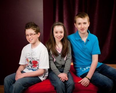
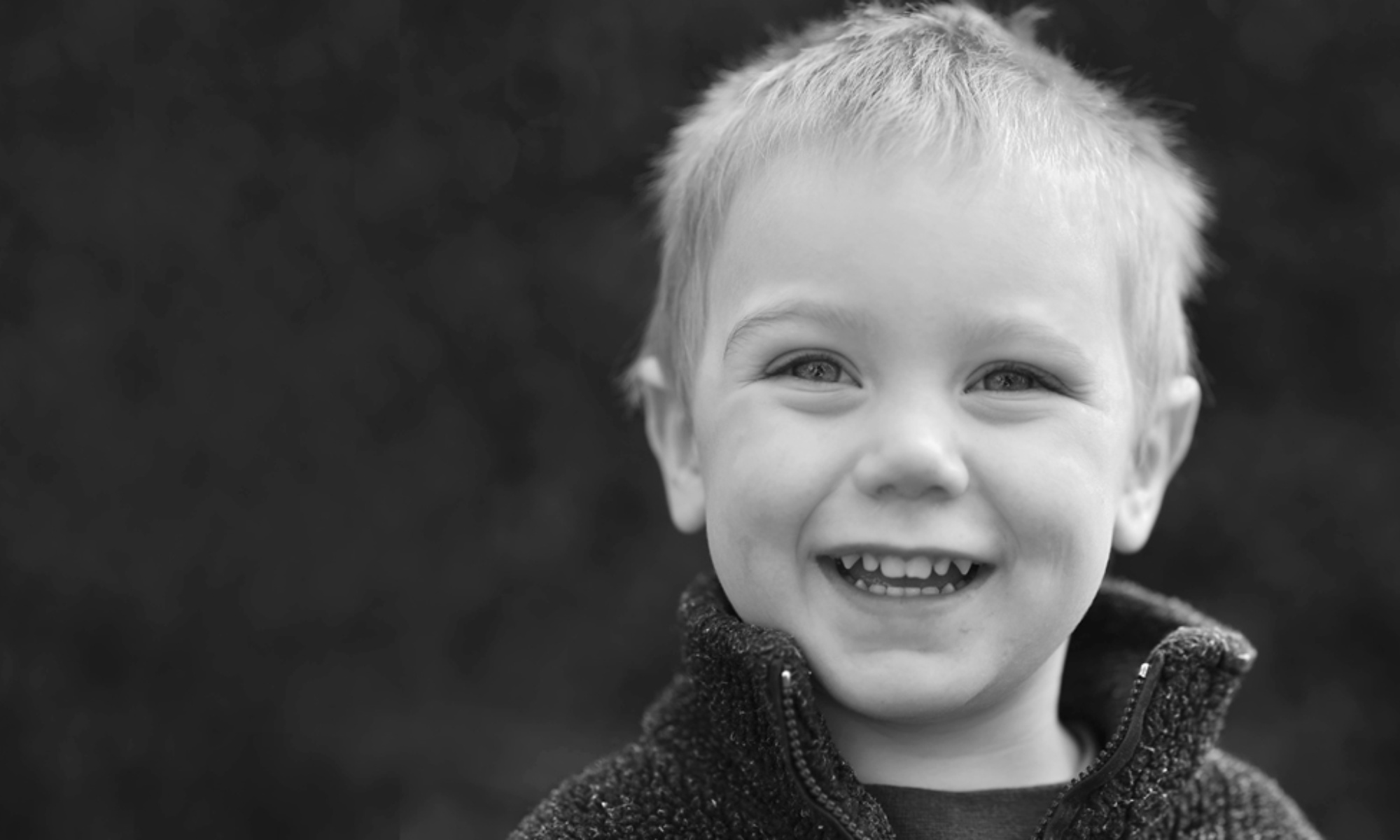
As I mentioned in a previous post, the Gallery Sessions last year were a big hit: a convienient way to get a great range of pictures of a whole family at a reasonable cost (and with no initial outlay).
But me, being me, couldn’t help messing with the format a bit.
It’s no news that I’m not a fan of flat backgrounds. I started a blog post about that very subject and it turned into a small essay – so we’ll have to work out where to go with that one at some stage.
But these are studio sessions and we need a background. So we chose something less ‘photographery’ and flat with more texture and deliberately set it up so it wasn’t smooth. The to help I tilted it to give some depth.
But at times the purple backdrop came up very dark and a bit flat last year – even when I started lighting it independently. So we looked at other options: more depth, more options for posing full length, better lit and more space for larger groups.
My motto would always to ‘use what you have’ first and by turning everything around and incorporating the Gallery partion we hit on something new and way more interesting. Moreover shooting into the angle adds more depth.
It’s deeper, brighter and gives options for leaning against the partion. You get good separation with darker clothes and taller people in the group and we have extra seats, stools and other props this year to make more interesting group setups.

Just to finally add those links to the Communion information:
Communion and Confirmation Sessions
Communion and Confirmation Packages

